Client: American Express & Disclosure
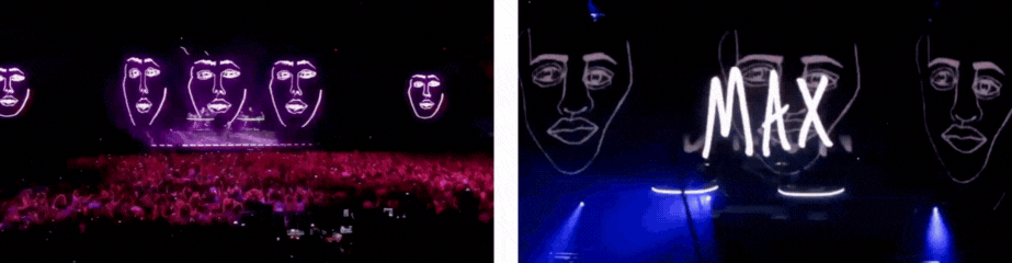
Working with Radical Media in New York, we leveraged the Disclosure ‘face’ and “Caracal” artwork to create an app experience where fans could take a selfie and then customise their own Disclosure Face. They could then submit it to a living gallery and share on their social channels. Fans loved it so much we received submissions from all over the world. Even the show's Executive Producer, James Corden, created his own Disclosure Face.
This activation was meant to heighten fan engagement and capitalise on the prominence of mobile apps and it did just that. Almost 80% of all app users who downloaded at the time participated in the ‘Disclose Your Face’ activation.
A couple of years prior to Radical Media, I assisted Studio Moross with working on animating Sam Smiths facial features for Disclosure’s live show visuals, enhancing the overall aesthetic and audience experience. I also helped with developing lettering styles for some of the One Direction tour.
(Speculative work)
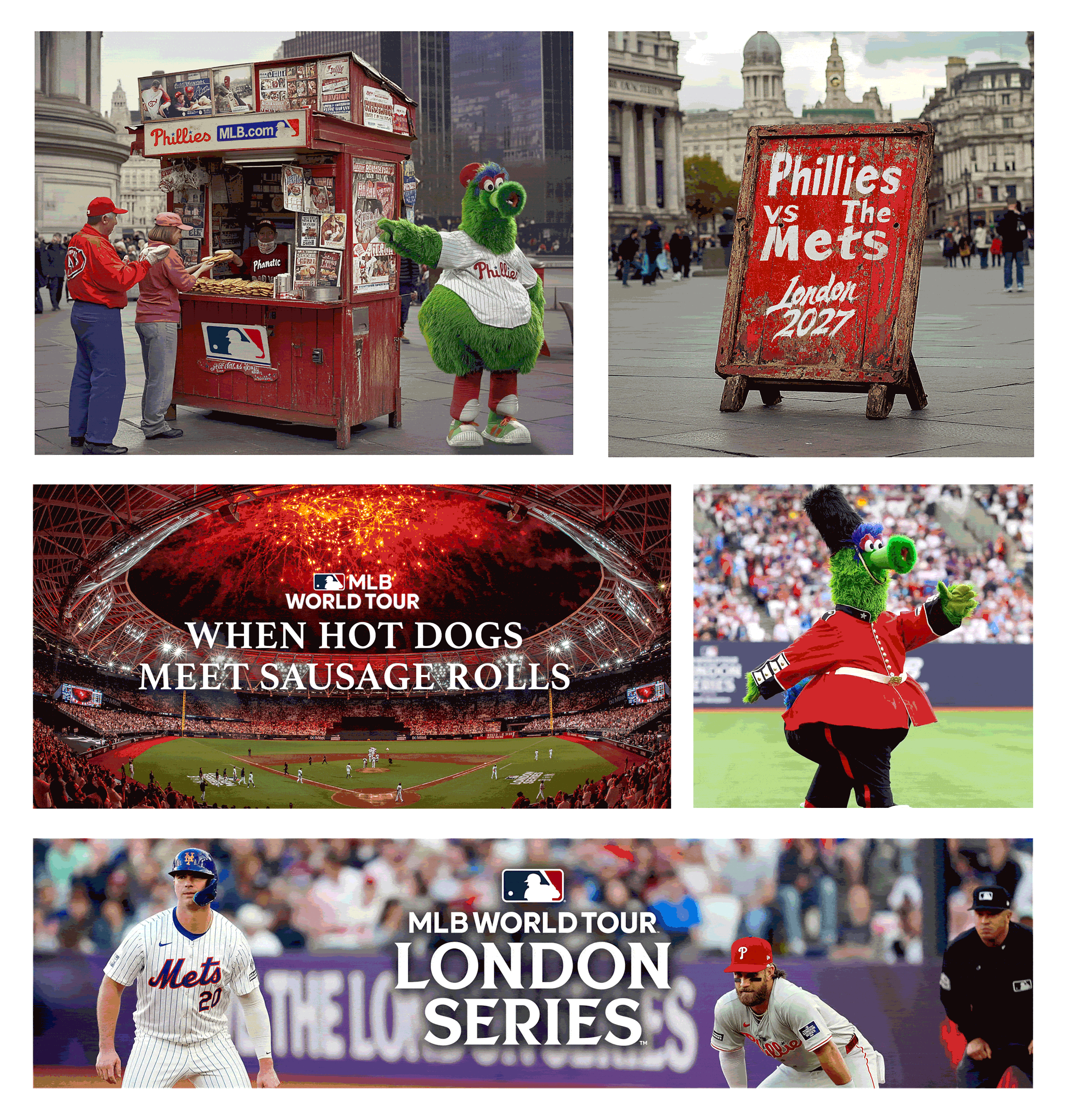
Project idea: MLB London Series – Outdoor Activation Campaign.
Concept can be applied to MLB, NBA or NFL.
As part of the MLB's highly anticipated London Series, a series of outdoor activations would be a perfect way to bring the excitement of America’s favourite pastime to the heart of London. This project centres around erecting vintage, American-style newsstands strategically placed across the city, offering an immersive and promotional experience that bridges American baseball culture with London’s vibrant atmosphere.
The newsstands are more than just points of sale; they serve as immersive hubs for fans and passersby alike. Each stand features a curated selection of merchandise, tickets for the MLB games, and food inspired by the hometowns of the teams competing. These stands not only promote the upcoming MLB Series but also offer fans a taste of the teams home culture.
Additionally, the activation brings energy and engagement through the presence of team mascots, who interact with the public in fun, playful ways. Fans are encouraged to participate, pose for photos, and get excited about the upcoming event.
This activation would be carefully designed to blend seamlessly with the London landscape while providing a memorable, interactive experience that draws attention and spreads the excitement of the MLB London Series throughout the city.
Working alongside of the newly appointed Head of Nike's Women's Department, Dorinda Ross, we created a series of illustrations. They were designed to visually support key messages, adding a personal and creative touch to the presentation while reflecting Nike's values of empowerment, innovation, and diversity.
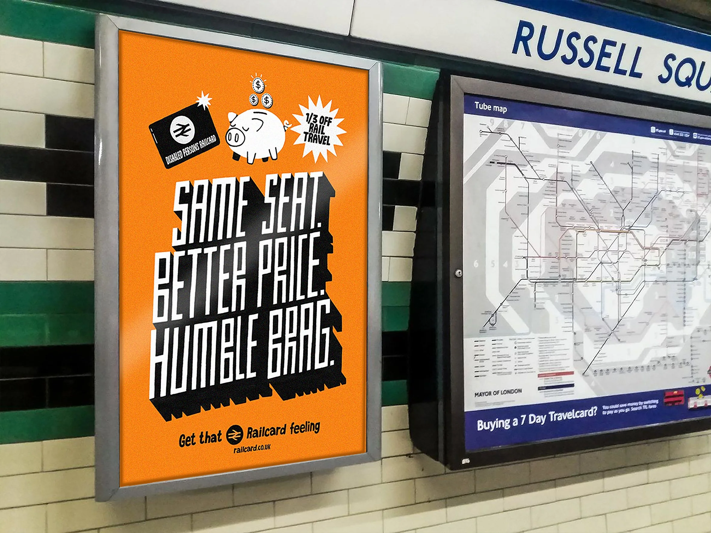
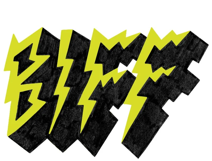
I launched a project called “The Biff, the Bad and the Ugly” as a creative response to my frustration with poor design.
After repeatedly seeing the dull and uninspired National Rail posters scattered across London, I decided to redesign them myself. The goal was simple: to create something more engaging and visually appealing. As a regular commuter, I don’t think it’s too much to ask for our public spaces to be filled with designs that are actually enjoyable to look at. Am I right?
Meal Deals on Wheels: Elevating the Everyday Lunch
The humble meal deal is a national treasure. A go-to staple for anyone grabbing lunch on the fly. My idea is simple, take that quick-grab lunch and turn it into a more wholesome experience.
Enter my concept: Meal Deals on Wheels.
It’s a simple idea with a big impact. Take the classic meal deal and give it a glow-up. We’re talking plated up sandwiches (yes, on actual plates), crisps served in a little bowl (because we’re fancy like that), and your drink poured over ice in a proper glass. Suddenly, your grab-and-go lunch feels more like a café experience.
The best part? It’s about bringing people together. Sitting down with a friend or a colleague and catching up on how the dog’s doing post-vet visit or what chaos the kids caused this week. Because food shouldn’t just be fuel, it should be a shared moment, a little pocket of joy in the middle of the workday.
That said, a big shoutout to the solo lunchers- this is for you too. Sometimes you just need a breather and a quiet minute with a sandwich and your own thoughts. That should feel just as good.
And guess what? It’s still only £5. We’re talking affordable, elevated lunch. No guilt, no fuss, just good vibes and better presentation.
There’s also room to level up even further. Toasted sandwiches with a drizzle of sauce? Yes, please. Coke float with a scoop of ice cream? Don’t mind if I do. Or how about crisps loaded with melted cheese and jalapeños? Supermarkets already have the goods, let’s just start using them in smarter, tastier ways.
Meal deals don’t have to be boring. Let’s make lunch something to look forward to again.
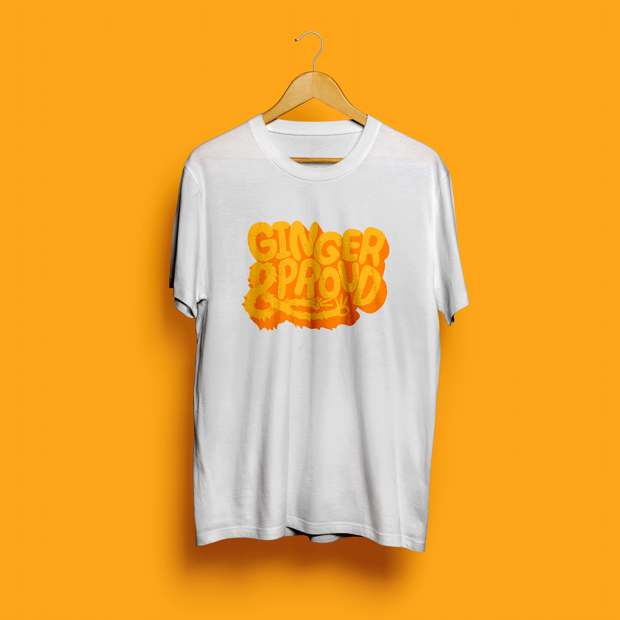
Moju – “Ginger and Proud” Outdoor Activation
While working at creative studio Otherway, I helped develop a playful outdoor activation for health drink brand, Moju. The concept was to promote their new health drink by handing out free ginger shots to people with ginger hair on National Ginger Day. I created the slogan “Ginger and Proud,” which became the centrepiece of the campaign. Bold, cheeky, and on-brand, the line was rolled out across T-shirts, stickers, and event materials, capturing attention and celebrating natural spice in every sense.
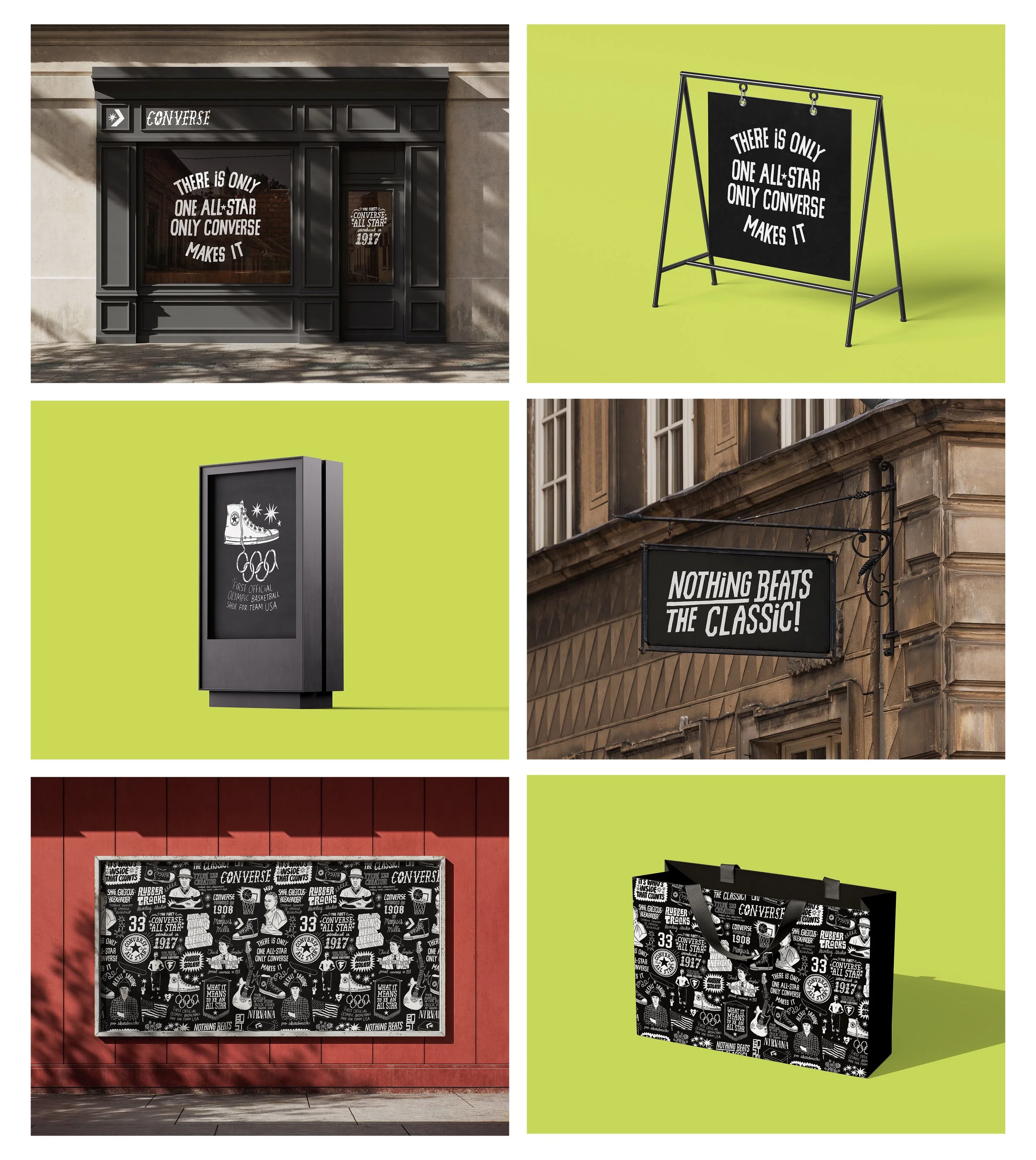
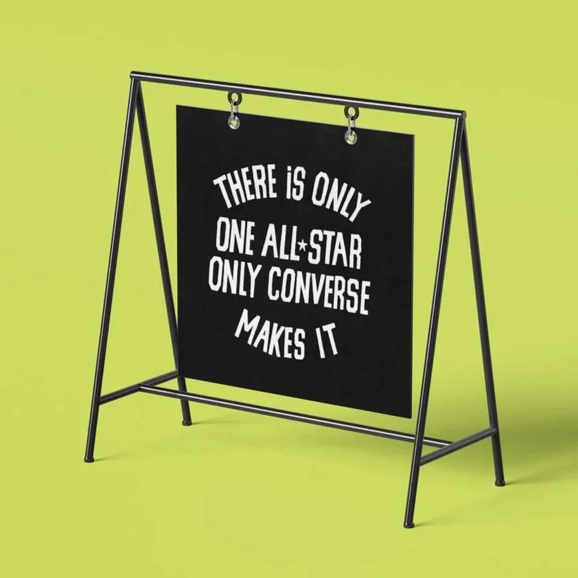
This self-initiated project began with a simple desire- to dive into something rich in history, cultural relevance, and visual gold. After purchasing what must have been my millionth pair of Converse, the subject became clear.
Converse has a remarkable legacy. Spanning sport, the military, movements for equality, and beyond. Its influence is broad and deeply ingrained in pop culture.
I set out to create a repeat pattern that captures a personal, visual overview of that story. A design that, at a glance, reflects who they are and what they represent.
The result is a versatile piece that could be used for wallpaper, wrapping, or even as part of an OOH campaign. Each illustrated element also stands on its own, ready to be repurposed however needed- Merchandise, window displays, signage, packaging etc… the list goes on.
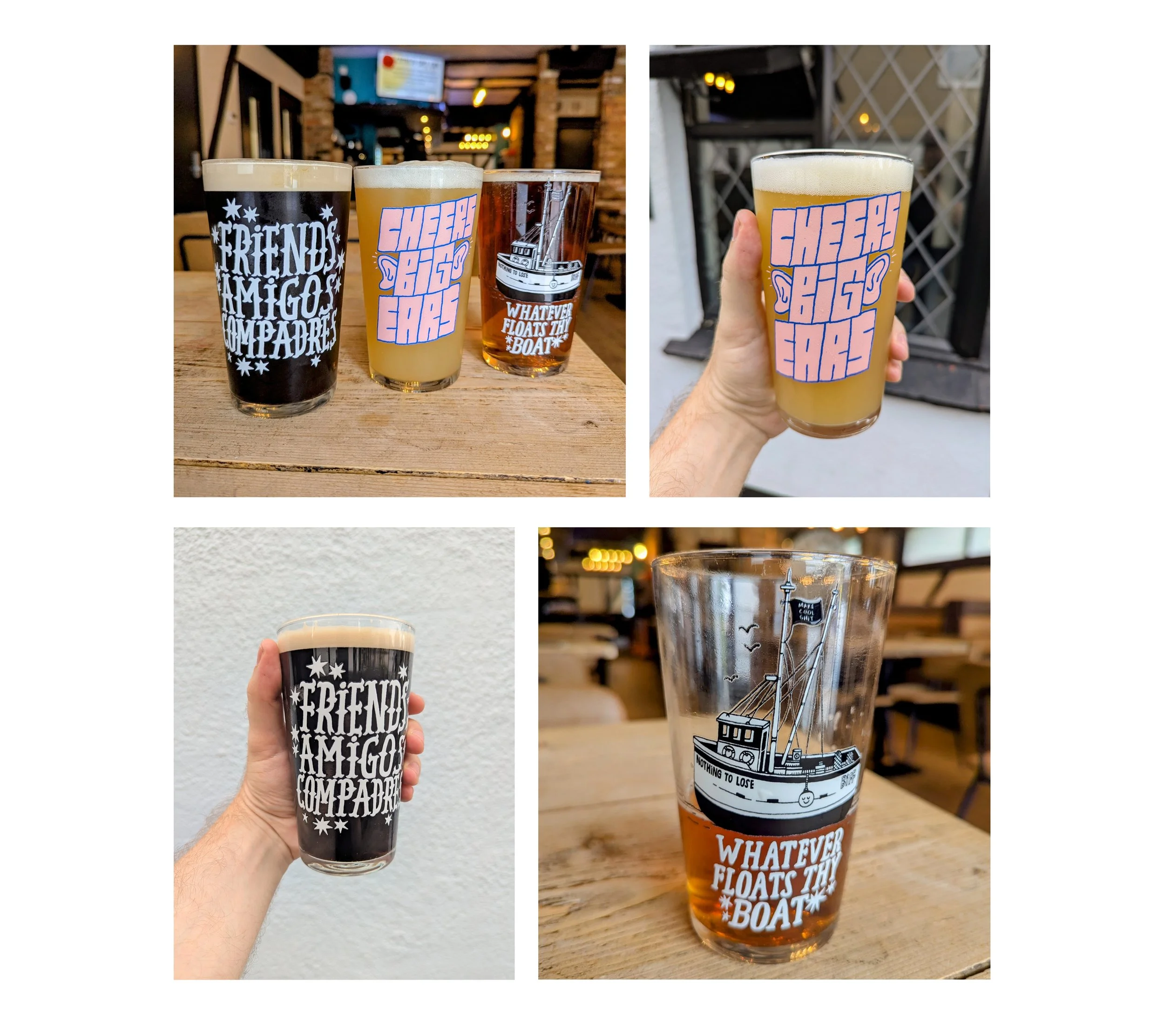
Pint-Sized Impact
Breaking into the beer industry hasn’t been easy. So I thought, “Fuck it! I’ll do it myself..”
To me, the humble pint glass is untapped advertising real estate. It’s passed from hand to hand, placed on every table, and seen by everyone in the room. So why not use them for good?
This concept turns everyday pint glasses into conversation starters. The designs are bold, playful, and rooted in the spirit of communal beer drinking, all while giving your bar or brewery a visually memorable edge. But it goes deeper than just clever copy.
Pubs are social spaces, but they’re also places where a lot of men go to escape, to cope, or simply to be alone in a crowd. It’s no secret that many men struggle to open up about how they’re really feeling.
By partnering with a men’s mental health charity (and potentially a macro brewery) this campaign uses pint glasses to spark subtle, powerful moments of reflection. Lines like “How’s everything, really?”, “Need a chat?”, or “Whatever it is, get it off your chest” appear where you least expect them- in your hand, mid-pint.
Add in thoughtful quotes from figures men admire, e.g. Vinny Jones, Anthony Joshua, Arnold Schwarzenegger. We’ve got something that’s not just eye-catching, but emotionally resonant too.
Maybe there’s a small QR code printed somewhere on the glass, or a coaster which leads to a website, where you can write down whatever thoughts you’re having- anonymous and pressure free.
Men shouldn’t suffer in silence. Let’s give them a nudge and an incentive to open up.
I developed the concept for a special edition Jack Daniel’s label in celebration of World Whiskey Day. Inspired by the original design, I hand-drew key elements while incorporating my own creative touches to reflect the spirit of the occasion. Since the product itself is crafted by people, I felt it was only fitting that the label be created by hand as well. Made with care, by humans, for humans.
I worked with agency VMLY&R to collaborate on out-of-home assets for the film 'Sorry I Didn't Quite Catch That' for the charity STAMMA in support of 'International Stammering Awareness Day'.
Having grown up with a Stammer myself, it was very easy to relate and put my stamp on it. It’s a debilitating affectation to have and I was proud to shed a bit of light on it.
Also, Director LIAKH's satirical film follows the surreal customer service experience of ‘Debbie’ who is trying to return a coffin. It draws attention to the everyday difficulties that people with dysfluent speech have dealing with customer service, and encourages not jumping in and letting those with a stammer finish their sentences. I came up with a handful concepts and lettering lock-ups for the films titles.
Watch the video here: https://www.youtube.com/watch?v=0CiwNO9p_JE